Color is one of the cheapest levers in restaurant interior design and one of the least understood. A palette cannot cook a dish or seat a party faster, but it does shape how long guests want to stay, how bright the room reads at 8 p.m., and how the same plate of food looks under it. Operators who repaint a dining room often notice the change in table turns before they can name the cause.
The honest starting point is that color is not a property of the wall. It is a perception, produced when light reflected off a surface activates the cone cells in the eye, as Wikipedia's overview of color explains. That distinction matters operationally: a paint chip chosen under showroom lighting will not behave the same way under dimmable LEDs at dinner service. The room, the lamp and the palette have to be judged together.
What is color, physically, and why should a restaurateur care?
Color is the visual result of light in the visible spectrum, roughly 390 to 700 nanometers in wavelength, reflecting off surfaces into the eye. Most humans perceive it through three types of cone cells, a system called trichromacy. Nothing mystical sits in that description, but it carries two practical consequences for a dining room.
First, the same paint can look different under different light sources, an effect related to metamerism: two colors that match under one light may diverge under another. Second, intensity changes color. Wikipedia notes that a low-intensity orange-yellow reads as brown, and a dimmed yellow-green reads as olive. A palette engineered for a bright lunchroom therefore collapses into a different, darker palette at candlelight levels. That is not a flaw in the paint; it is how perception works. This connects to our earlier piece, Lighting layers in hotel corridors and public spaces: task, ambient, and accent light that works.
Do warm colors really speed up a dining room?
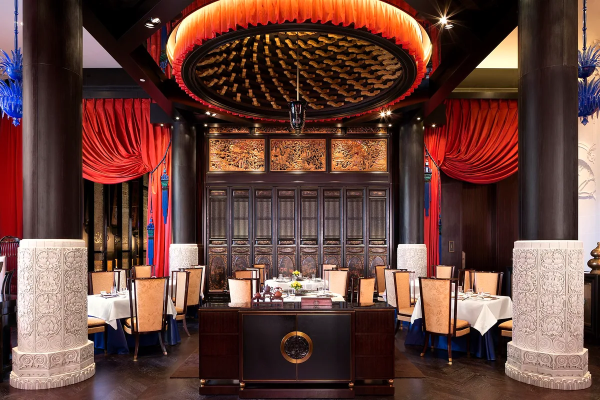
The widely repeated claim is that reds and oranges make people eat faster and leave sooner, and that blues suppress appetite. The strong version of that claim is folklore. What the evidence base supports is narrower and more useful: colors have long been associated with emotions and levels of activity, and those associations shape how energetic or restful a room feels. A red-walled room reads as busy and warm; a pale blue-grey room reads as calm and cool. Guests respond to that reading, even if nobody has proven a reliable effect on check averages.
The defensible operator takeaway is directional, not numerical. Warm, saturated palettes suit high-turn concepts where the room should feel lively and the seating is priced for volume. Cooler, lighter, less saturated palettes suit rooms where the business model depends on dessert orders and a second bottle of wine. The palette should match the revenue model, not a pop-psychology rule.
How do saturation and lightness change the room?
Two properties matter more than hue in practice. Saturation is how pure or intense a color is; lightness is how bright or dark it is. A deep burgundy and a blush pink share a hue family but produce opposite rooms. High saturation raises perceived energy and, over a long meal, fatigue. Low lightness makes a room feel smaller, warmer and more enclosed, which can be a feature for a wine bar and a defect for a family dining room.
Lightness also interacts with lighting design. Dark walls absorb light, so the same fixture count delivers less usable illumination, and the room leans harder on accent and task lighting to keep tables readable. This is the same layered-lighting logic that governs hotel public spaces; the lighting layers in hotel corridors and public spaces apply directly to dining rooms, where a single ceiling grid almost always fails at dinner. Readers following this should also see Lighting the guest room: layered light, warmer evenings, and why one ceiling fixture fails.
What does color do to food on the plate?
The dining room palette is also a backdrop for the product. Strong wall colors reflect onto plates and glassware, and a saturated ceiling or banquette can tint white tablecloths and pale dishes. Wikipedia's account of how objects acquire color, through absorbing and reflecting different wavelengths, explains the mechanism: the wall is a light source by reflection, and everything in its path receives that light.
Operators can check this cheaply before committing. Order the finish sample, put it beside a white plate under the actual dinner lighting, and look. A green that flatters the room may make a burrata look unwell. Neutral, low-saturation backdrops near the table, with color held in upholstery, artwork or the bar, keep the food as the most saturated thing in the guest's field of view.
What this means: a practical sequence for choosing a palette
Our analysis of how these factors interact suggests a fixed order of decisions, which keeps the palette tied to operations rather than taste alone:
- Define the target dwell time and revenue mix first. A room built for turns and a room built for lingering want different energy levels, and that decision constrains every color choice after it.
- Fix the lighting design before the paint. Judge every sample under the lamps and dimmer levels that will run at service, not under showroom or daylight conditions, because metamerism and the Bezold–Brücke shift, in which hues drift toward yellow or blue as light intensity rises, will move the colors.
- Keep table zones neutral and low-saturation so the plate reads true; push color into surfaces guests touch briefly or see in passing.
- Plan for wear. Corridor and entry colors live with scuff marks, luggage wheels and cleaning chemicals, a durability question that hotel designers weigh constantly and restaurant operators often skip.
- Sample at full scale. A painted one-meter panel under service lighting tells more than any fan deck.
The acoustics of the room interact with all of this more than most operators expect. Hard, colorful surfaces bounce sound as well as light, and a bright palette on hard plaster can make a lively room feel frantic once it fills. Pairing palette decisions with the discipline described in hotel acoustics design keeps the energy level the owner chose at lunch intact at 9 p.m.
Where the science ends and the judgement begins
Color science can explain why a paint chip shifts under the dinner lamps and why intensity changes what a hue reads as. It cannot tell an operator whether terracotta will outperform sage in their room, with their menu, under their rent. That part remains a design judgement, best made against the revenue model and verified at full scale before the painter books the closure days.
The durable rule is modest: treat the palette as equipment, not decoration. It runs every service, it ages, and it either supports the pace of business or quietly works against it. Operators who repaint with the lighting plan in hand, and who test samples beside the actual plates, spend the same money and get a room that behaves.